TeachingBooks.net is delighted to welcome Steve Jenkins, the author and illustrator of Animals By the Numbers: A Book of Animal Infographics and many other books, as our featured guest blogger this month.
Each month, we ask distinguished authors or illustrators to write an original post that reveals insights about their process and craft. Enjoy!
Animals by the Numbers:
The Anteater’s Tongue and Infographics
by Steve Jenkins
I’ve been preoccupied with scale, beginning with Biggest, Strongest, Fastest (Ticknor & Fields 1995), which I wrote more than 20 years ago (yikes). Working on that book, I realized that simply showing an illustration of an elephant, even one accompanied by facts and figures, did not adequately express the creature’s true size. It’s difficult, even for adults, to wrap one’s head around the fact that the elephant can weigh 22,000 pounds. So I included a simple infographic, a small silhouette of each animal, alongside another of an adult human (or a human hand, if the animal was small).
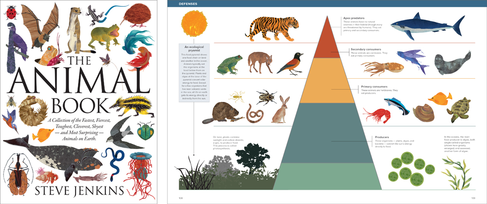
I’ve incorporated this kind of graphic representation/reference in many subsequent titles. Most of them have been 32 or 40 pages in length, typical for a picture book. This format feels familiar and manageable, but it often requires leaving out things that I’d like to include. A few years ago I created the 212-page The Animal Book (HMH 2013). All that real estate allowed me to devise more elaborate informational graphics, and that book includes a page or two of them at the end of each chapter.
While working on and thinking about those visuals, it occurred to me that for years I’d been watching my own kids and their friends negotiate complex multilevel graphics as they played video games. Some game screens struck me as overwhelmingly complex, with 3-D maps, bar graphs showing scores or the health of dozens of characters, multiple icons and symbols, and lots of other stuff I couldn’t interpret. But the kids had no trouble making sense of it. Most video game visuals don’t have much informational content that’s relevant outside the confines of the screen. Interpreting infographics that do contain informational content is a related but somewhat different skill.
Creating the infographics for The Animal Book was fun, and made me realize that we shouldn’t underestimate children’s visual literacy. It also led me to create Animals by the Numbers (HMH 2016), a book that consists almost entirely of infographics. I set out to include as many kinds of charts, graphs, and diagrams as I could, incorporating interesting facts about animals. (I worked as a graphic designer for many years before and after I began making children’s books, so designing these images felt familiar). Like reading text, interpreting graphic information gets easier with practice, and it’s a skill that will undoubtedly become more important as sophisticated software is making infographics easier to produce, and more print and digital content is being presented in visual form.
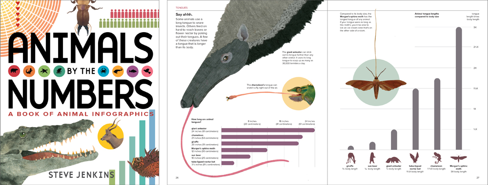
Now, about that anteater tongue. The giant anteater can stick its tongue out 24 inches, farther than any other animal (whales, of course, have longer tongues, but they don’t protrude). But the Morgan’s sphinx moth has a tongue that is three times the length of its body, the longest animal tongue relative to body size. So the graphs on this spread have to be read in two different ways: absolute and relative length. For young readers, it’s an important distinction to make.
Using infographics has changed the way I think about making books. Thankfully, in my work at least, text and art are not going away. I like to think that having one more way to explain the world can only be a good thing.


Leave a Reply