
Divide and Conquer
How I Made Hoops, My First Graphic Novel
After I graduated from college, when I was trying to get my first book published, I spent a few years working part-time for my dad’s company, Tavares Design Associates. During those years, I learned a lot of new skills—how to check blueprints, how to write specs, stuff like that. For each new task, my dad would give me the same advice. It was something he had told me countless times, since I was a kid:
“Figure out a system that works for you, and then: divide and conquer. “
-Manuel J. Tavares
I used to marvel at graphic novels and think that it would be amazing to make one someday, but honestly had no idea where to start. There were just…so many pictures! It was hard enough planning out a picture book, figuring out where to use a close-up, where to show more of a wide view of the scene, and how it all works together. And that’s over a span of 32 or 40 pages, with usually just one illustration per 2-page spread. A graphic novel was a whole other beast. The thought of 200 or 300 pages, with 4 to 6 pictures per page? It boggled my mind.
But then I found myself working on a picture book that was growing into something unexpected. The story wanted to be bigger, and for an older audience. I realized that this book really needed to be a graphic novel. But I wasn’t sure how to do that. So, I remembered my dad’s advice. I figured out a system that worked for me, and I got to work.
Now that my first graphic novel is out in the world, I thought it might be helpful and fun to share all the steps that went into making it. I’m sure every graphic novelist does things their own way, but here is the system that worked for me.
Step 1: The Script
Once I was ready to dive in and really get to work, my first step was to write a script. This part of the process was much closer to writing a movie script than writing a picture book. To prepare, I read books that focused on writing for film and television. Most helpful were The Secrets of Story by Matt Bird (Penguin Random House, 2016) and Save the Cat by Blake Snyder (Michael Wiese Productions, 2005).
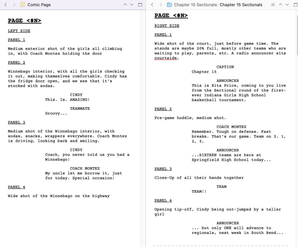
I used a program called Scrivener to write the script, which was a big help. It allowed me to organize all my thoughts, research notes, and drafts, all in one document. In the script, I mapped out every chapter, every page, and every panel of the book. For each panel, I described what would be happening in the picture, and included all dialogue and captions. This would serve as my blueprint for the next step, the dummy.
Step 2: The Dummy
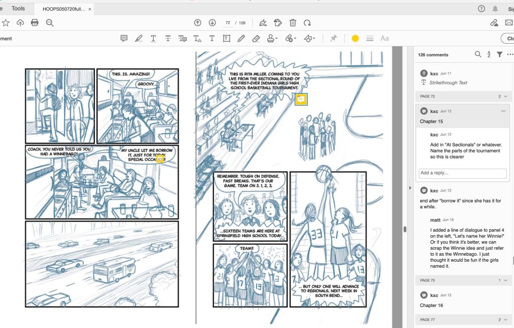
Once the script was written, the next step was to create something called a “dummy.” A dummy is a rough draft, or a practice version of the book. Using a program called InDesign, I started setting up the pages. Before I actually drew any of the sketches, I went through the whole book and drew the panel borders, picturing what would go in each panel and figuring out which ones should be bigger (a wide shot showing a crowded high school gym, for example), and which ones should probably be smaller (an image of one character talking, for example). Once I went through and drew all the pictures, I could adjust the sizes of each panel as needed.
Here’s a two-page spread from the dummy with some of my editor’s comments.
Step 3: Ink
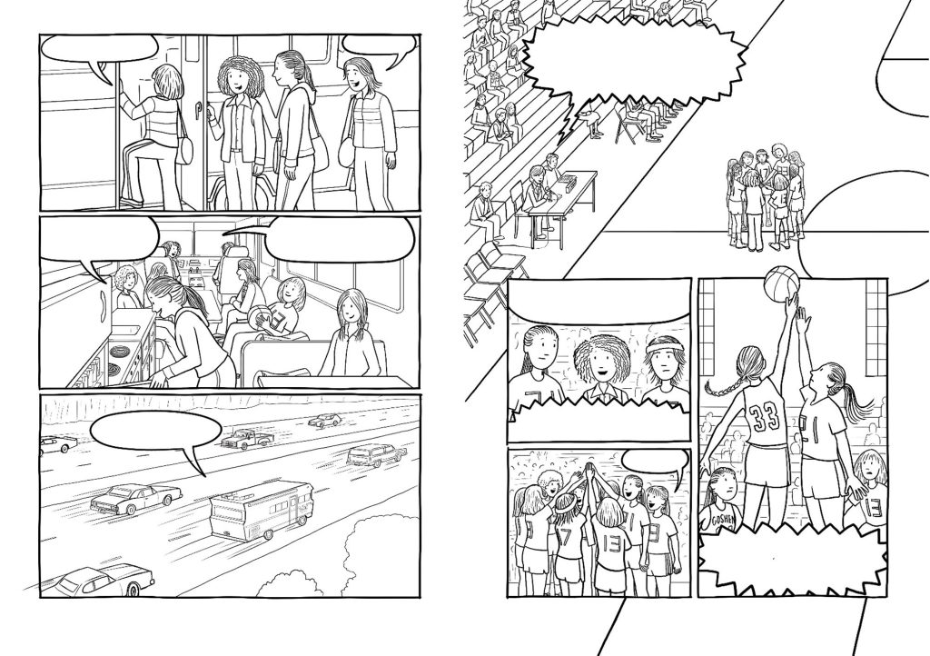
Next, I did all the line art. I created the art for this book in Photoshop using a Wacom Cintiq drawing tablet, so I never used any actual ink. Still, I thought of this phase as “inking.” I wanted the book to have a hand-drawn look, so I drew every panel border by hand by tracing the mechanical panel borders from the dummy. Then on a separate layer in Photoshop, I drew all the word balloons. Then on other layers, I drew all the characters and backgrounds. This step took me about 6 months.
Step 4: Color
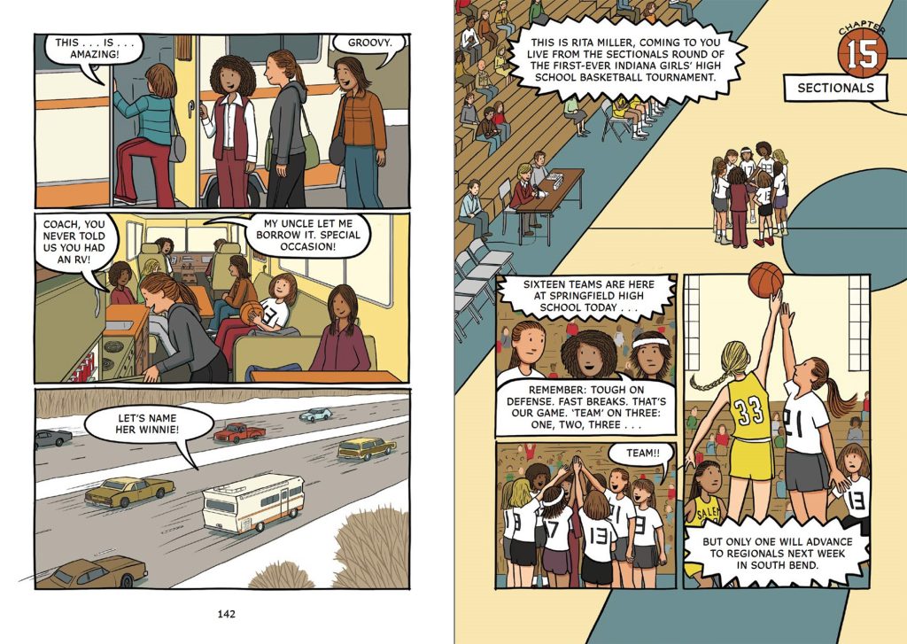
Once all the ink was done, I went right back to the beginning and started adding color. In this artwork, I focused on clarity and readability, so I used a lot of flat colors with minimal shading. This part of the process was fun, because I started to see how the finished book was going to look. I spent a little over 6 months doing all the color.
Step 5: Color, Again…
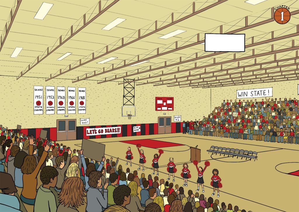
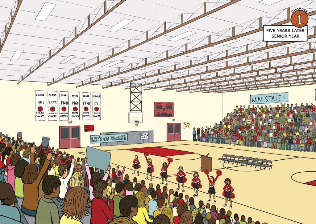
I thought I was done after Step 4, but then I got extensive feedback from my art director. Long story short: they weren’t crazy about the color palette that I had used. The story takes place in 1976, and I gave the book a very 1970s vibe. Lots of brown, beige, olive green, and orange. They felt like it needed a brighter, more modern color palette. I let myself freak out for a little bit, and then I got back to work. I spent another 6 months or so re-working all the color.
Here’s how the high school gym looked at first.
And here’s how it looked after I went back and changed the color palette. They were right, it looks better this way.
Overall, I spent about two and a half years working on this book. It was like nothing I had ever done before and for the most part, I loved the process. There are definitely things I learned that I will do differently next time. But if you’re thinking of trying to make your own graphic novel, hopefully this helps.
And my best advice is for you to remember my dad’s advice.
Figure out a system that works for you, and then…
Divide and conquer.
Text and images are courtesy of Matt Tavares and may not be used without express written consent.

So grateful you taken the time to pass along share your craft and artistry.