TeachingBooks.net is delighted to welcome award-winning author and illustrator Gareth Hinds as our featured guest blogger.
Each month, we ask one distinguished author or illustrator to write an original post that reveals insights about their process and craft. Enjoy!

How to (Re)Tell a Story in Pictures
by Gareth Hinds
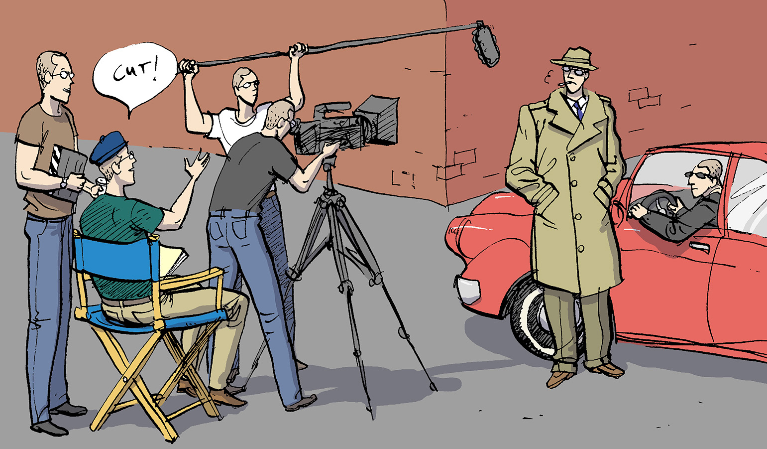
Drawing a graphic novel is a bit like making a film—on your own. The artist becomes the writer, director, production crew, costume designer, art director, location scout, cinematographer, the special effects team, the actors, and the editor. Unlike film, however, the images are static and time, motion, and sound must be implied through picture sequences, or by descriptive text, such as “We waited for hours,” or “WHAM!”
Telling a story in pictures is so natural and fundamental—think of the cave paintings. Still, doing it well isn’t easy. The artist has to decide how best to use pictures, text, and “meta” elements, such as sound effects and panel shapes to convey the action and emotion. How much dialog or narration should be included? What’s the best way to depict each scene? What about the panel layouts and the color palette? In the course of drawing a graphic novel, there are thousands of such decisions to be made. Without any hard and fast rules, I rely on my intuition, but there is a method to how I approach the task.
Early on I decided that instead of writing original stories, I would work with the very best writers, such as Homer and Shakespeare, and focus my energy on what really fascinates me: how to (re)tell a story in pictures. So, my first step is getting comfortable with the work I’m adapting, reading it several times and taking notes on the themes and scenes I want to highlight, while simultaneously starting to visualize how it should look.
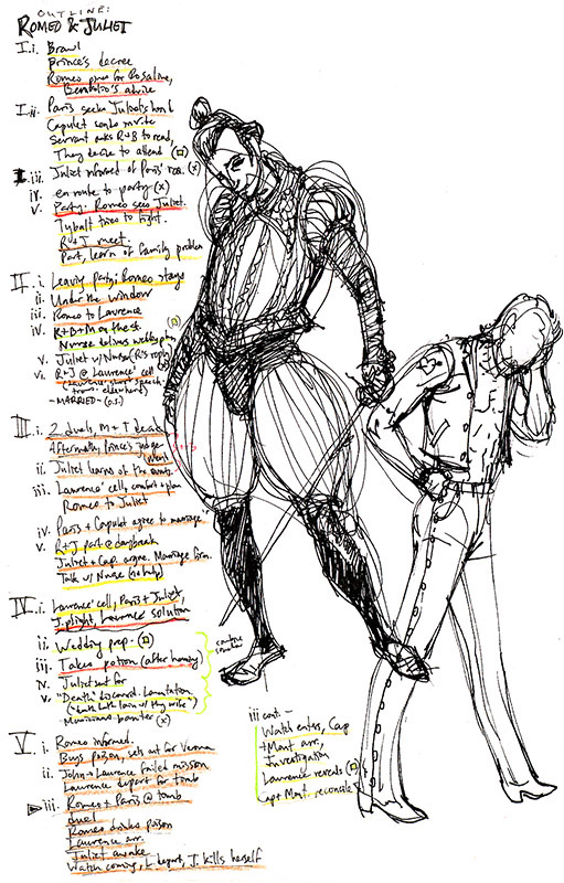
Here’s a section of the outline for Romeo & Juliet (Candlewick, 2013). The scenes are underlined in different colors, reflecting how I view their relative importance. On the same piece of paper I’m starting to brainstorm visually by creating rough character sketches. I adapt my style to each book, partly because I enjoy visual experimentation, but mostly because each tale has its own visual requirements. The streets of sun-drenched Verona in Romeo & Juliet should create a different feeling than the Scotland of Macbeth (2015), and the dark urban humor of The Merchant of Venice (2008) shouldn’t be drawn in the same way as the outsized action of Beowulf (2007; all Candlewick).
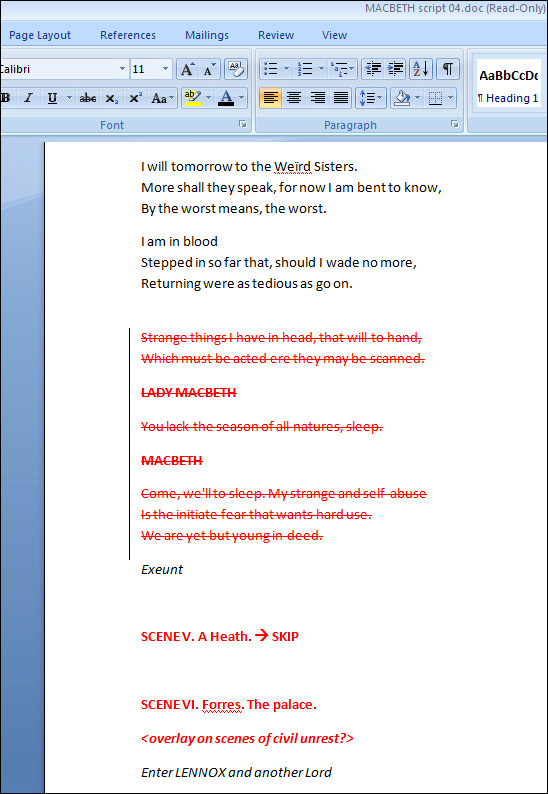
I continue to sketch and conduct visual research throughout the writing stage, moving from rough outline to script, trimming out unessential narration and dialog, identifying and refining the most important passages, and making sure the result flows well. At the same time I’m starting to finalize character designs, costumes, and settings.
Next comes the layout, the heart of the comic medium, which involves figuring out which moments to depict and how to compose them. Comic artists often use the same terminology as film directors, speaking in terms of establishing shots, close-ups, low and high angles, two-shots, and so on. But we must also determine how to place these pictures together on a page, leaving the right amount of room for text and sound effects, as we lead readers chronologically through the panels at a pace appropriate to the scene. The layouts for Beowulf were rough thumbnail images in a sketchbook, but I’ve since switched to creating them digitally. This allows for more fluid experimentation, and makes text placement easier and more precise.


After the layouts are edited and approved, I enlarge them, transfer them to heavy paper, and start on the final illustrations. The challenges here are the same as those when creating any kind of representational art: capturing accurate, expressive drawing and color, representing the correct light, form, and depth, etc. But there are a couple of special issues. First, there are a huge number of drawings in each graphic novel, so I really have to work fast. Second, I have to maintain continuity—from one panel to the next characters must look the same in costume and coloring, and their body language and expressions must match the dialog and/or action.
I scan the finished art, touch up mistakes, and sometimes, color the art digitally, as in this example from Macbeth. Speech balloons, panel borders, and any sound effects are added, each on separate layers for easy editing (e.g. copyedits and/or translation into another language).
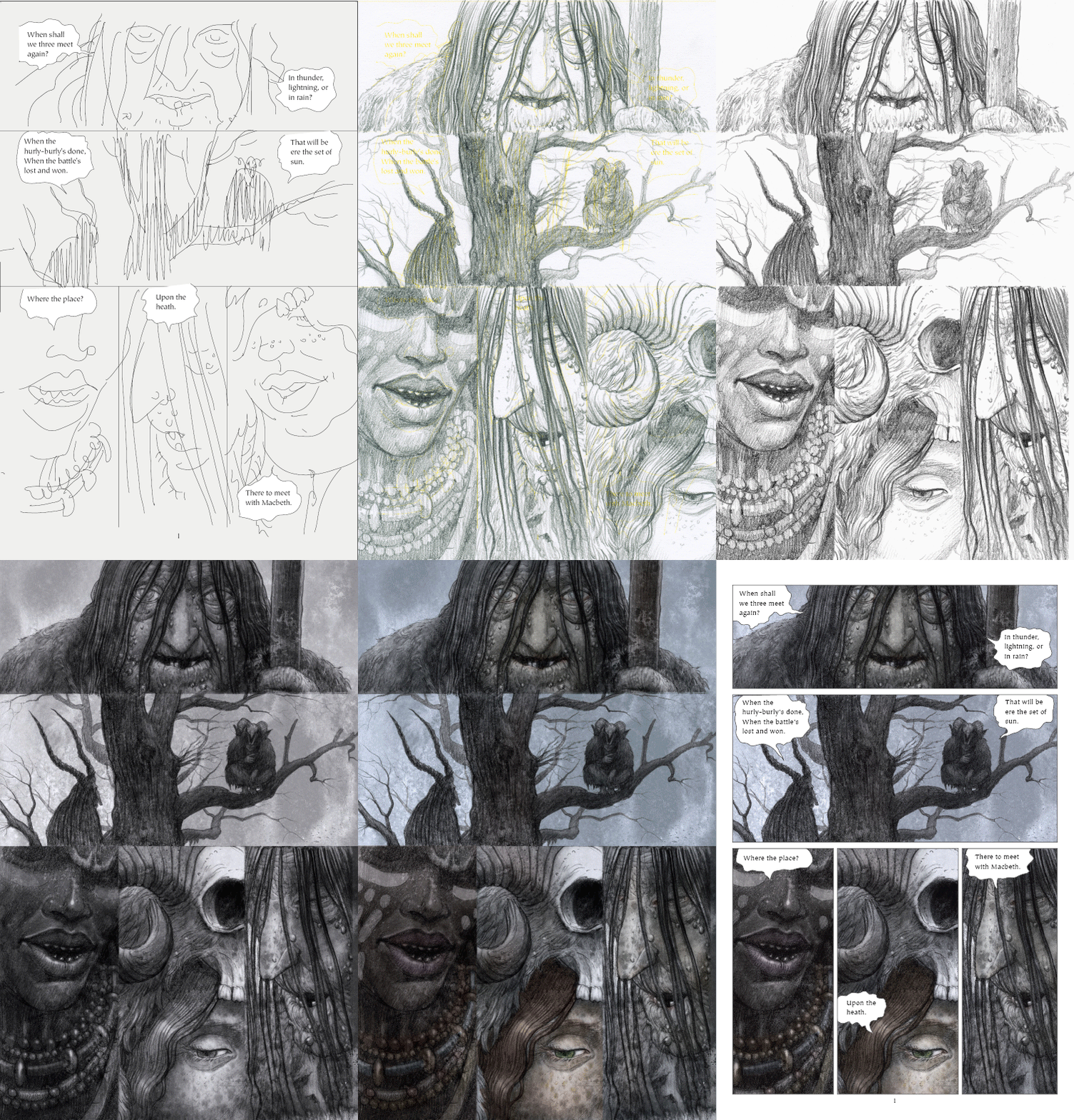
Finally, I deliver the manuscript to my publisher on a DVD (or two). This begins a 12-to-14-month waiting period before the book appears in stores. During that time I review copyedits, proofs, and cover designs, and make marketing plans…and hopefully, complete the next book!
Gareth Hinds introduces and shares the story behind creating The Odyssey (Candlewick 2010).
Listen to Gareth Hinds pronounce his name.
See all available resources about Gareth Hinds and his books.
All images ©1997-2015 by Gareth Hinds. Images from Macbeth appear courtesy of Candlewick Press. All text and images may not be reproduced with out the express written consent of Gareth Hinds.

Thank you so much for sharing the link to Gareth Hinds’ Behind the Books guest blog post on your site Fairrosa Cyber Library!