TeachingBooks.net is delighted to welcome award-winning illustrator and author David Wiesner as our featured guest blogger.
Each month, we ask one distinguished author or illustrator to write an original post that reveals insights about their process and craft. Enjoy!
The Art of the Cover
by David Wiesner

Designing the cover is my final step in creating a picture book. It’s only after spending so much time in the interior of the book—realizing the characters and their world—that I can stand back and consider what one picture would best sum up the experience of the story.
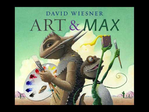
For the cover of Art & Max (Clarion 2010) the question I asked was, “What image will convey the essence of the characters’ relationship without divulging the story’s surprises?” I knew I didn’t want to depict any of the transformation scenes, so I decided to focus on finding an elegant visual representation of the creatures and their personalities.
For every cover, I draw many variations. Once I’ve decided on the basic concept, I refine the details: body positions, expressions, and gestures, until they feel right. I want a clear picture of the final effect, so I make nearly finished, full-size drawings.
Here are some of the pictures I created for the cover of Art & Max, and a few words about my reaction to each phase of the process.
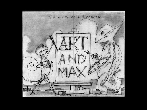
I liked the visual block that the trio of three-letter words formed (“Art and Max”), but the image felt too posed and stagy: not dynamic enough.
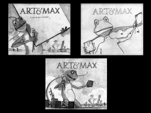
Here I explored ways to fit the characters and the title on the cover. I found the images interesting, but each was too focused on just one character.
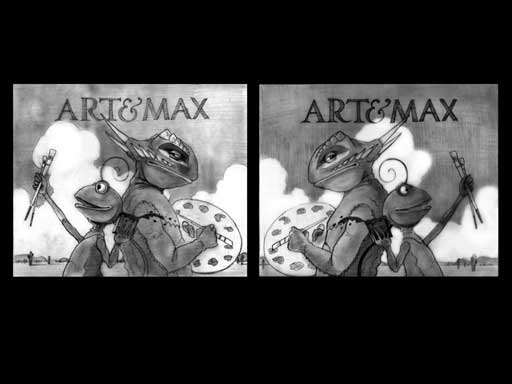
With this drawing I was getting closer to defining the energy and personalities of Arthur and Max. Their back-to-back stance appealed to me, but I realized their names and their images initially had opposite orientations.
At this point I generally liked where I was with the cover, so I began the detail work, including the characters’ positions and expressions. This image has so few elements; everything had to be carefully considered.
I really liked how the shape of the Arthur’s palette echoes the swoop and curve of Max’s tail. I wanted to include the entire palette, and I tweaked the hands and thumbs to make sure they could be read clearly. I also had to plan where Arthur’s horn would cross the “M” of Max.
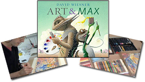
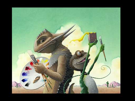
This is the finished painting for the front cover. (It’s the same size as the book cover.) The skies are in watercolor; everything else is acrylic. (This holds true for the interior as well, except where Arthur changes to pastel or pen and ink.)
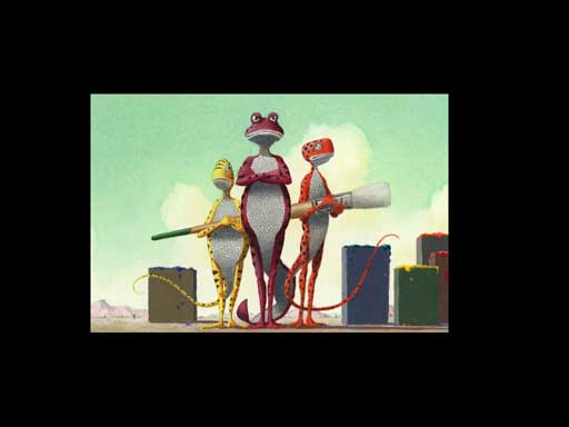
This is the finished painting for the back cover. Here I was able to highlight the secondary storyline in the book: the grumpy lizard who just wants his portrait finished.
NOTE: Reader’s often ask how long this work takes. From my first sketch of the cover to finishing these paintings took me just about two weeks.
Typeface plays an important part in Art & Max. Each character speaks in a different font and each font is a different color. The fonts reflect their personalities: a classic serif for Arthur, the contemporary sans serif italic for Max. I am always looking to use visual cues whenever possible.
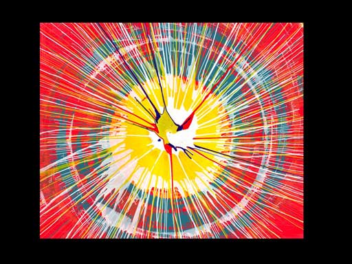
It is great fun to try to use every inch of the book to add to the story and reading experience. The next step was to illustrate the binding—the cover of the book that’s under the jacket. One idea I explored was a spin-art image (and I had to concoct my own spin-art machine from an electric eraser I had in my studio).
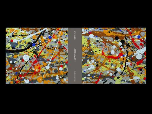
This is an example of my spin art, trimmed to the size of the book cover. It was pretty cool, but ultimately I chose a Jackson Pollack-like splatter painting.
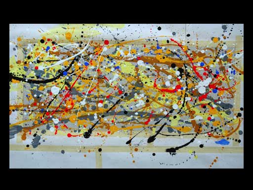
Here is the splatter art in progress.
This is the printed binding with the typeface in place.
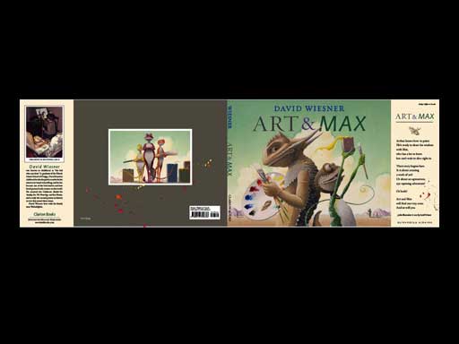
The final cover showing the front, back, and flaps.
This material may not be used without the express written consent of David Wiesner.
Hear David Wiesner pronounce and speak about his name.
Access all of TeachingBooks.net’s online resources about David Wiesner and his books.






Leave a Reply